UI - UI - Oh!
Skeuomorphism, Diegesis, and You
We want people to play our games. To get them to do that we need to make sure that the components, artwork, graphic design - the entire package - work together to give a smooth play experience.
In video games and product design this is called User Experience (UX) or User Interface (UI). UX/UI professionals have many techniques to make users more comfortable with their products. I’d like to talk about two of them today - Skeuomorphism and Diegesis. Skeuomorphism is commonly used in tabletop. Diegesis is much less common and may open up some new areas for designers and spark your creativity.
Skeuomorphism is modeling a product or graphic design after something physical in the real world, to create a metaphor in the user’s mind about how something works, or perhaps simply to make them feel more comfortable.
When the iPhone launched in 2007, Apple leaned heavily into a skeuomorphic user interface. The calendar looked like a calendar. The notepad had a spiral binding on the side, and lined paper. Here’s what early versions of the iBooks app looked like:
You can see the strength of metaphor in this image. You just want to reach up and pull a book off the shelf, right? Or fill those empty spots with new purchases?
Skeuomorphic interfaces are at their most useful when we encounter something unfamiliar. When it first launched, the iPhone interface was something completely different. Tying apps into something familiar for the users was a smart move on Apple’s part.
As people became more familiar with smart phones, the UI moved away from skeuomorphism. The ‘metaphor’ stuff like the bookshelf takes up screen space and makes the interface less efficient. Here’s the latest iBook library screen:
The titles are now just floating in space - although, if you look closely, you’ll see that there are little ‘crease’ marks on the left side of each cover that, coupled with the drop shadows, makes the tiles look more like physical books. It’s a subtle effect, but it’s there.
Skeuomorphism in Tabletop
Skewmorphism is most useful when people are approaching an unfamiliar situation. You know when people are always facing an unfamiliar situation? When they sit down to play a new game. Unsurprisingly, skeuomorphism has found its way into a variety of board game designs.
To reiterate, the definition of a skeuomorphic design element is one that has no function, but exists to make the element look like something from the real world.
As you can imagine, there is no lack of skeuomorphism in game art. As an example, here are the player mats from Heat: Pedal to the Metal:
It is designed to look like the dashboard of a car, complete with gauges, stick shift, and more. There’s even a little charm or keychain hanging off the dashboard.
For those unfamiliar with the game, the gauges on the player mat show the sequence of play. Obviously, there are a ton of different ways to give the player that information. But incorporating them into the dashboard and making them look like car gauges, immediately accomplishes a few things
Increases the sense of immersion
Orients the player (if you didn’t already know, it’s now clear you’re driving the car)
Gives a hint towards functions - the gear shift is located where a gear shift is in a car, so you can assume it has something to do with speed
Is just fun
I do have a bit of a quibble with this skeuomorphic design. The metaphor of a ‘gauge’ is something that gives you feedback about a situation. It can change in response to what is happening. The gauges in Heat are static. They simply walk you through the sequence of play. I personally found it a bit jarring the first time I played it. The gauges did not do what I was expecting.
This is minor, of course, and it obviously hasn’t impacted the success of the game.
I’ve used skeuomorphic elements to many of my games. In Space Cadets Dice Duel the board is styled to look like a control panel in a spaceship that’s seen better days. It’s held together with screws, some of which aren’t quite seated properly, there are scratches around the edges, and some of the display indicators are broken.
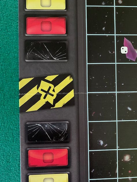
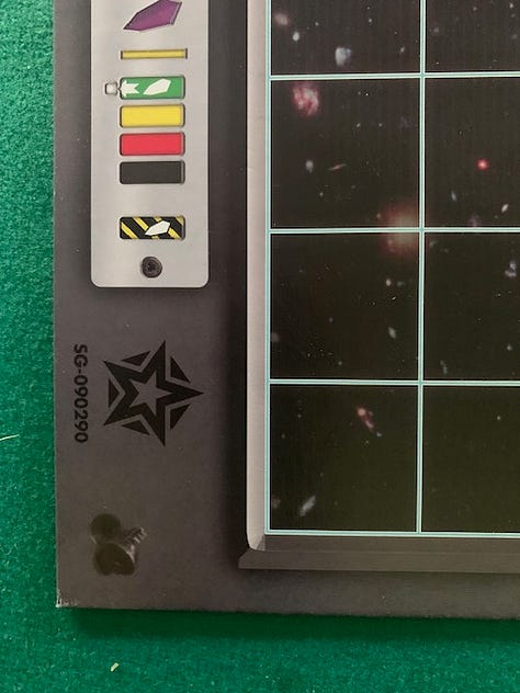
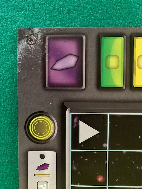
The broken display indicators actually do serve a game purpose, as they are the last spaces on the damage tracks. If you get there your ship blows up.
Diegetic User Interfaces
A diegetic user interface is one where the player interacts with an object the same way a character in the world would actually do it.
This is a common technique in video games. For example, in Jedi Survivor, the player can customize their light saber. In order to do that, your character in the game needs to go up to special workbenches that are scattered throughout the world. You then physically manipulate the different light saber components you’ve collected until you get the configuration you want.
Here’s a video showing how it works:
Another way video games integrate diegetic UI is by having a wrist pad where they perform functions like check on stats or pick equipment. Half Life has in-world healing stations you need to use to heal - diegetic - whereas Diablo just has a health potion icon and you hit a hotkey to consume one.
Diegetic UI predates video games. The technique is frequently used in movies. For example, sometimes there’s a song playing that at first you think is background music, but then a character turns off a radio and the music stops, and you realize the song existed in the universe of the character.
Examples of diegetic elements in tabletop games are much rarer than they are in video games. I’m defining ‘diegetic’ as performing an in-game action the same way the character in that situation in ‘real life’ would do it. Obviously you’re not going to actually perform magic, or stab someone with a sword (or are you?). But there are ways to evoke the action in an immersive way.
Here are a few games that fall into this camp:
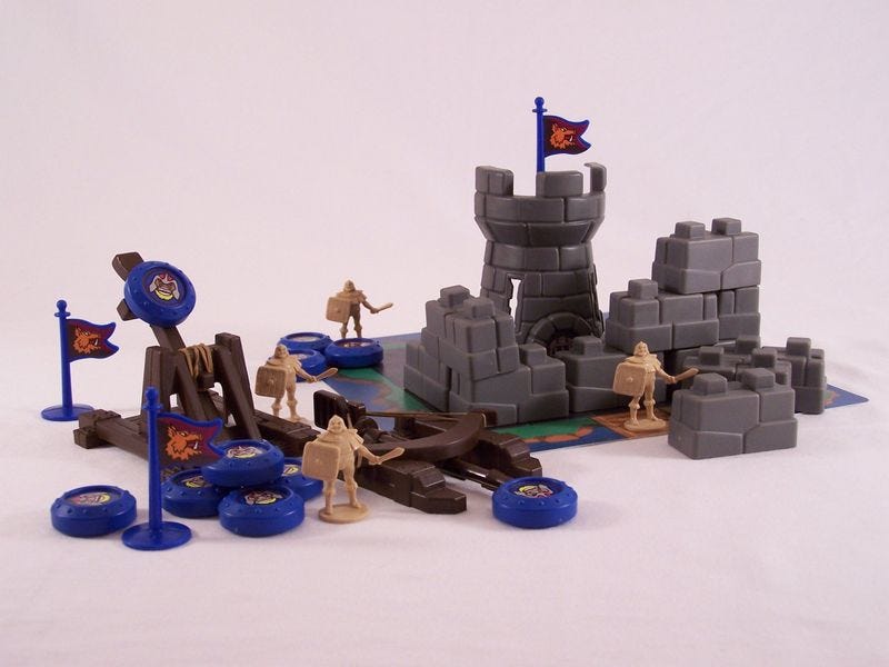
Crossbows and Catapults has you build castles and knock them down by launching discs from., well, crossbows and catapults.
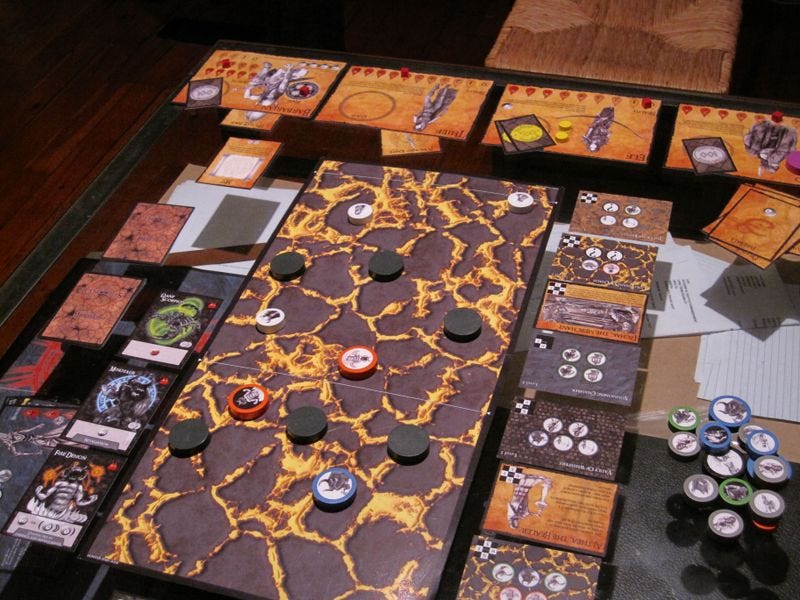
Related to this, Catacombs has a lot of features that are diegetic. Characters in the game are represented by discs, and you move by flicking them. Boards have holes in them, and you place large discs in them to act as ‘pillars’ that you can hide behind.
When you make a ranged attack, you place a smaller arrow or fireball disc next to your character, and then flick it at the target. It really gives you the feeling of leaning out from behind cover with your bow.
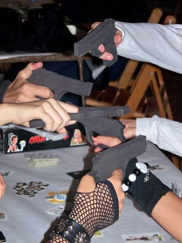
Games do not have to have dexterity elements to have diegetic elements. In Ca$h ‘n Gun$ players simultaneously point foam guns at each other to show who they’re threatening. Players then simultaneously choose whether to put their guns down or not if they want to drop out of the round.
There are plenty of ways this could have been implemented without the foam guns - have a card for each player for example, and you select your target by placing a face down card. But pointing guns at each other is way more thematic, and way more fun.
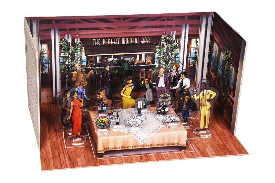
In Picture Perfect you try to arrange the guests to get the best photo, and the game ends with you actually taking a picture of your setup with your phone.
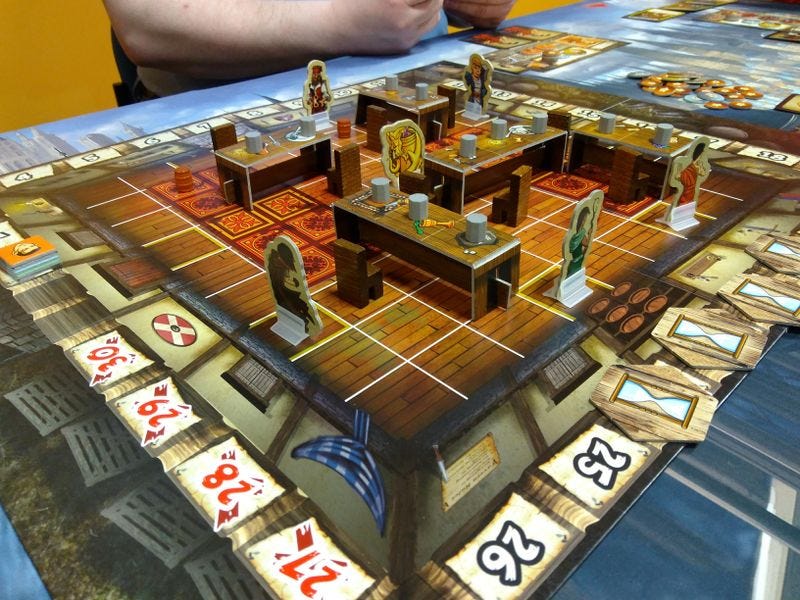
I used diegetic elements in our game The Dragon & Flagon. The game simulates a fantasy tavern brawl, and we wanted to give the game what we called a ‘dollhouse’ factor. Players would actually stand on tables, pick up chairs, etc.
You can also swing on the chandeliers. We really tried to make a physical chandelier that was hanging down from a stand that hovered above the board, but we just couldn’t make it work. But the diegetic elements really help make the game shine.
In spite of these examples, diegetic UI is much rarer in tabletop games than skeuomorphism. And rarity is usually an opportunity to do something creative. As I was researching this topic I was thinking about how I would make a game about magical duels that was diegetic, and I came up with what I think is a pretty fun idea. It’s different than the other attempt at this I’m aware of - the fun and underrated Rock, Paper, Wizard. In that game players simultaneously make hand gestures to cast spells at each other.
So I’m playing around with that now, and maybe it will amount to something. In any case, I’m having lots of fun coming up with ideas!
What other diegetic games are you aware of? What topics might lend themselves to a diegetic treatment? Let me know in the comments below.
Tabletop Game Designers Association
Elizabeth Hargrave, Sen-Foong Lim (co-designer of the aforementioned Rock, Paper, Wizard), and I have launched the Tabletop Game Designers Association! Membership registrations have been faster than expected, which has been gratifying.
The mission of the Tabletop Game Designers Association is:
To promote the craft of tabletop game design through education and support;
To advocate for the designers of tabletop games; and
To build community among game designers.
To celebrate our launch, we are offering membership discounts, and the full website is available to the public. In the future some parts of the site will only be available to members, but we wanted to give everyone a better understanding of what we’re about.
The services that we think are most important are contract review and dispute assistance. If you’re a member and have a question about a contract or are having an issue with a publisher, we can give you advice and help advocate on your behalf. We also offer several resources on the website around contracts, from simple contract checklists to a fully annotated sample contract.
Please check it out!



Skeuomorphism?
Both of these sound like they apply to Quacks of Quedlinburg. The player mat is shaped and designed to look like the cauldron in which your character is brewing their potion (skeuomorphism), and the player physically adds their components to the swirling cauldron as they craft their brew each round (diegesis).